
Your Navbar is one of the first things a visitor sees on your site. Encourage visitor interaction through enticing, clickable links, and be kind to your future self by converting the Navbar to a reusable Symbol that can be adjusted and updated at your whim.
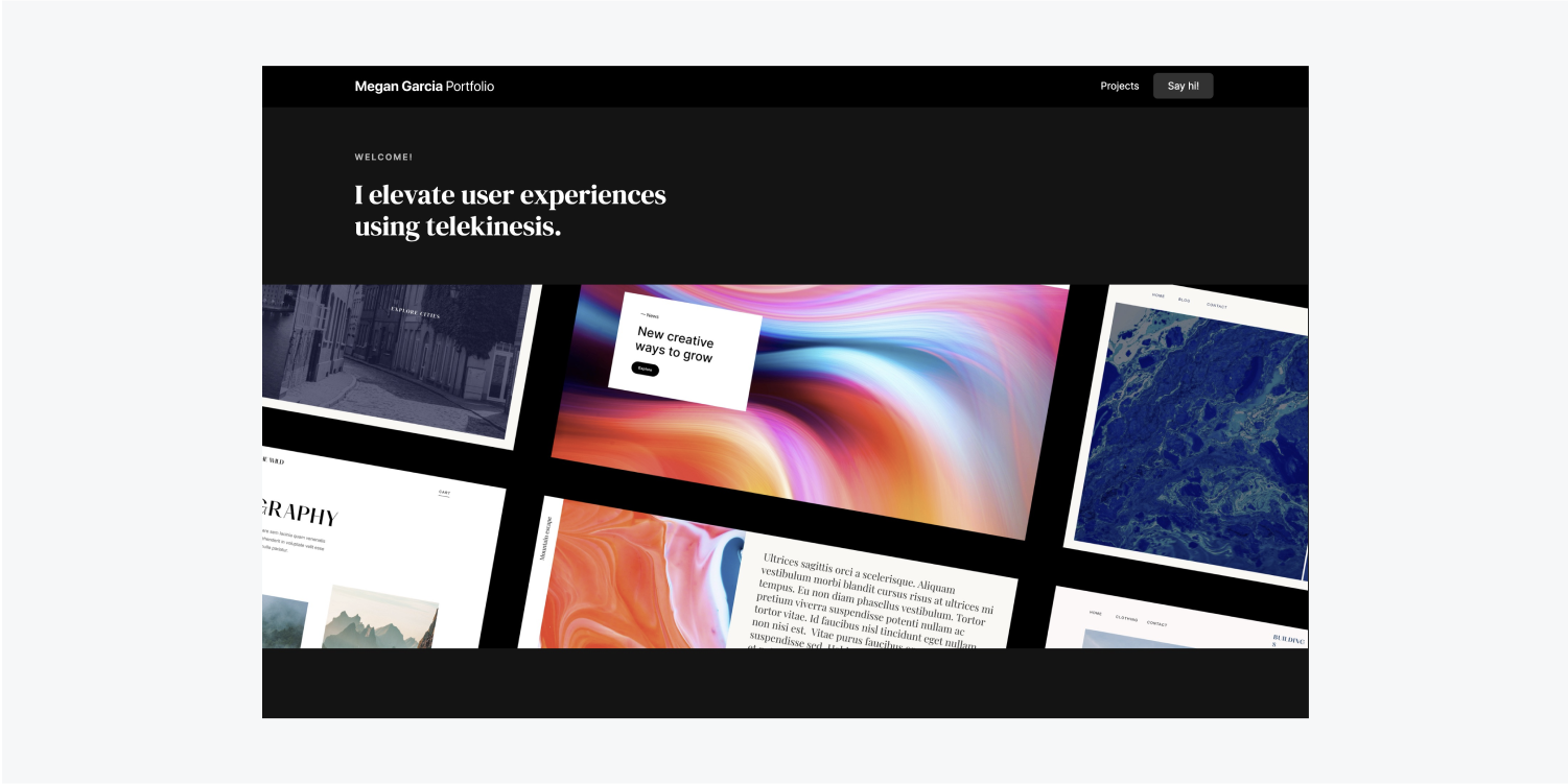
In this lesson, you’ll learn how to design a Navbar using the following:
Follow along and download the assets for this lesson.
Add the Navbar
Let’s add a Navbar to the top of the homepage:
- Open the Navigator
- Open the Add panel
- Go to Components
- Drag a Navbar into the Navigator and place it under the Body
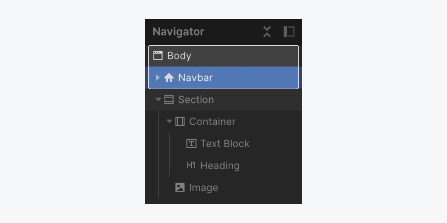
The Navbar component comes with some default elements, including a Container.
In our previous Homepage hero section lesson, we created a standalone Container placed in the Section. We set the maximum width of the Container to 1200 pixels, which automatically created a “Container” class.
Let’s reuse the “Container” class on the Navbar’s default Container so it also benefits from the 1200 pixel maximum width we previously created:
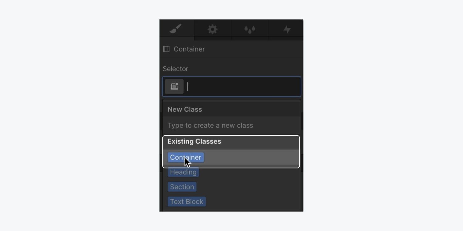
- Select the Navbar Container
- Open the Style panel
- Click into the Selector field
- Choose “Container” from Existing classes
Note: When you add a class to an element, all styling adjustments made on this element are saved in this class. You can reuse the class on new elements to automatically apply the styles saved in the class you created.
Style the Navbar
Let’s change the background color of the Navbar to help it feel more cohesive with our design:
- Select the Navbar
- Open Style panel > Backgrounds
- Open the color picker
- Choose black
Changing the background color of the Navbar to black makes our Navbar links blend into the background and become illegible. We’ll fix this after we add our logo to the Navbar:
- Open the Assets panel
- Drag the logo into the Brand Link block

Let’s make the logo smaller:
- Select the logo Image
- Grab one of the corner handles and drag it to 196 x 28 pixels
Let’s also center the logo and increase its clickable area by adding padding:
- Select the Brand Link block
- Open Style panel > Spacing
- Add top and bottom padding of 16 pixels
Note: You can quickly add margin or padding to opposing sides of an element by holding down Option (on Mac) or Alt (on Windows), and dragging one of the margin or padding controls.
Let’s style the Nav links to make them stand out against the black background:
- Select a Nav link
- Open Style panel > Typography
- Click the Color picker and set the color to white
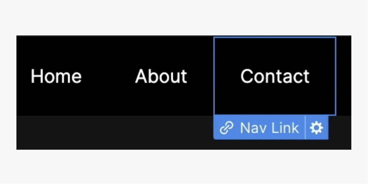
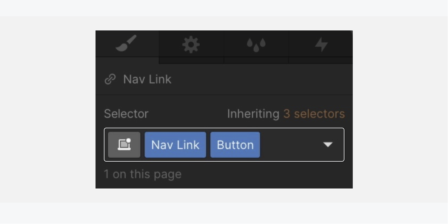
To apply these changes (and future changes) to all the Nav links, add the “Nav link” class to each Nav link in the Navbar:
- Select the next Nav link in the Navbar
- Click into the Selector field
- Choose “Nav link” from Existing classes
- Repeat these steps for the 1 remaining Nav link
Note: if you apply an incorrect class to an element, you can always delete the class from the Selector field, and choose the correct class from the Existing classes dropdown. Learn more about classes.
Let’s give the Nav links a little more space between each other by changing their padding:
- Select a Nav link
- Open Style panel > Spacing
- Add left and right padding of 34 pixels
Update each Nav link’s text:
- Select the first Nav link
- Double click the text to update (e.g., “Projects”)
Repeat the above 2 steps for the remaining Nav links to rename them (e.g., “About me” and “Say hi!”).

You can use a combo class to make the third Nav link (e.g., “Say hi!”) stand out a bit more from the first 2.
Good to know: A combo class is a separate class built on top of another class. The separate class allows you to apply style overrides on the original class to create a unique variation. Read more about combo classes.
Let’s add the combo class:
- Select the third Nav link in the Navbar (e.g., “Say hi!”)
- Click into the Selector field
- Type in a new class (e.g., “Button”) directly after the first class
Let’s style the new “Button” combo class differently and change its background color:
- Open Style panel > Backgrounds
- Click the default color swatch to open the color picker
- Set the color to white and lower the opacity to 20
Decrease the button’s padding:
- Open Style panel > Spacing
- Decrease top and bottom padding to 8 pixels
Round the edges of the button:
- Open Style panel > Borders
- Set the radius to 6 pixels
Add top margin to the button:
- Open Style panel > Spacing
- Set top margin to 12 pixels

The combo class you just created — “Nav link Button” — is based on the “Nav link” class. If you select any Nav link that has just the “Nav link” class applied, and then apply style changes to it, that style change will also apply to the “Nav link Button.”
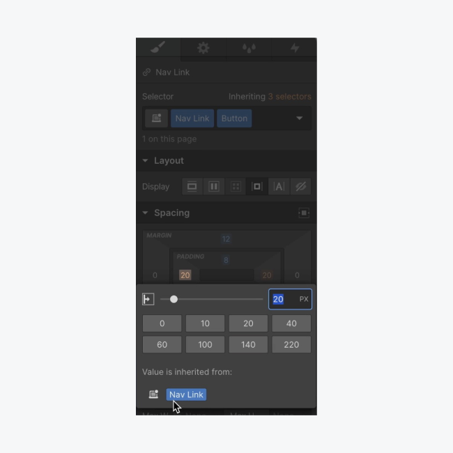
Let’s put this into practice and adjust the padding on the “Nav link” base class:
- Select a Nav link
- Open Style panel > Spacing
- Decrease left and right padding to 20 pixels
The “Nav link button” inherits this style change and its left and right padding is also 20 pixels.
Because we don’t need the “About me” Nav link for this design, click on it and delete it from the Navbar.
Make the Navbar a Symbol
Once a Symbol is created, it can be reused as many times as you want throughout your project.
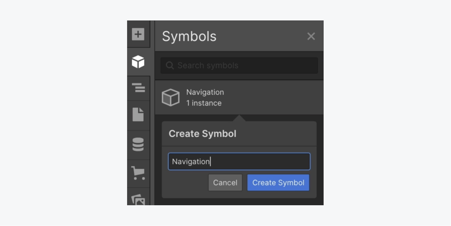
Let’s make the Navbar a Symbol so we can reuse it on other pages:
- Open the Navigator and select the Navbar
- Open the Symbols panel
- Press Create new Symbol
- Give the Symbol a name (e.g., “Navigation”)
After creating the “Navigation” Symbol you’ll be able to edit the Symbol.
In our example, we don’t need to edit the Symbol, so press “Back to Instance” to return to the particular instance of the “Navigation” Symbol in the project.
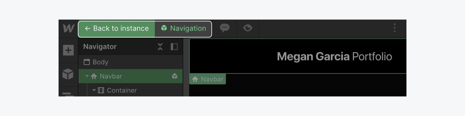
Good to know: You can double click a Symbol to edit the inner elements. When you make a change — for instance, adding new Nav links — any changed Symbol instance will affect all other instances of that same Symbol. In this example, each Symbol instance would show those new Nav links, too.
Congratulations — you’ve navigated the addition of your Navbar!