
Before you get started: Read the Components overview lesson to familiarize yourself with components.
Component properties let you define specific elements within a component that can be modified with unique values on a component instance.
This is great for recurring layout patterns whose structure should be uniform but have unique content in each instance. Or, you might want to slightly adjust the structure by hiding or showing specific elements in different component instances.
Note: If your component has the exact same content in each instance (like navbars, footers, and some forms), you don’t need to create component properties for that component’s elements.
In this lesson, you’ll learn:
- Supported properties
- How to create component properties
- How to modify property values on component instances
- How to reorder, delete, and disconnect component properties
Supported properties
Supported component properties include:
- Content properties (to modify content in a component instance)
- Visibility properties (to hide or show an element in a component instance)
Note: To modify styles on component instances, use the class custom attribute.
Content properties
Content properties allow you to customize your element content in a component instance. For example, let’s say you have a hero section design that you want to use in multiple pages across your site. The design structure should remain the same, but you need different paragraph content in each component instance. You can create a component property for your paragraph and modify that paragraph content anywhere the hero section appears on your site.
Supported elements include:
- Text (e.g., paragraphs, headings, etc.)
- Image
- Video
- Link (e.g., buttons, link blocks)
- Rich text
Visibility properties
With visibility properties, you can create layout variations on different component instances by showing or hiding specific elements.
For example, you could create navbar variations by showing and hiding links or buttons within the navbar component. Or you could create button variations by showing and hiding different icons. You could even create entire section variations by showing and hiding multiple different elements in the component, like images, videos, buttons, links, and more.
Visibility properties can be used on all elements.
Pro tip: If you’re having trouble selecting a hidden element in a component instance, open the Navigator, and select the hidden element from within the component’s element hierarchy.
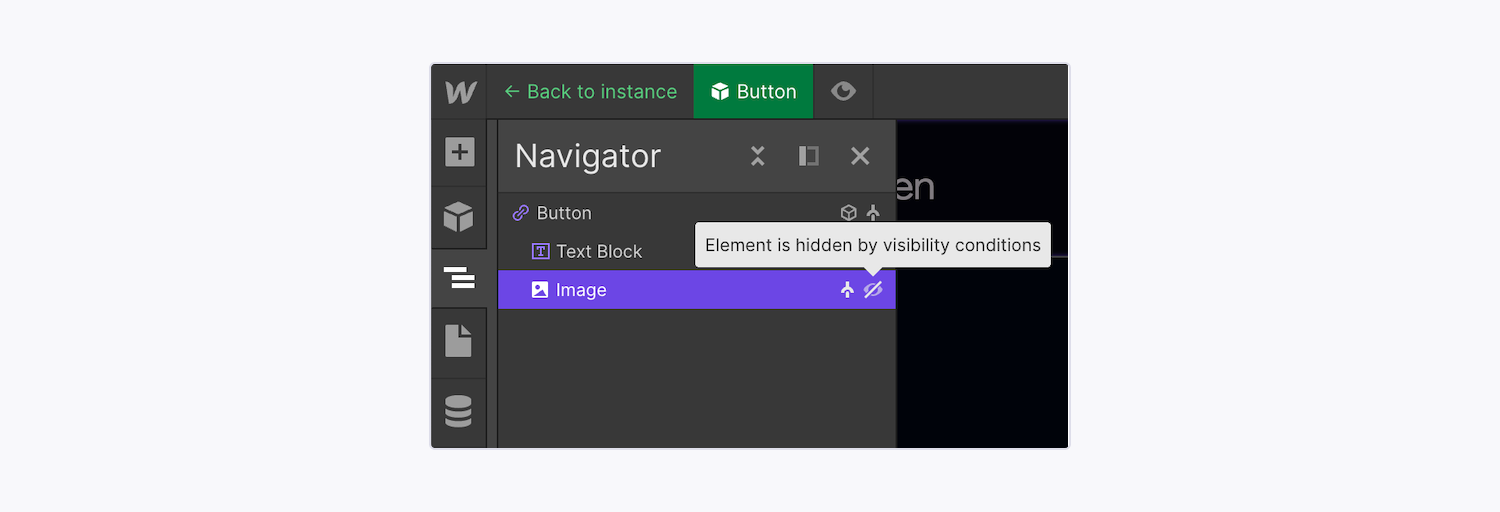
You can locate hidden elements in components by expanding the component hierarchy in the Navigator panel. Hidden elements are indicated with a “struck-through eye” icon.
Good to know: Elements set to “hidden” are removed from the Document Object Model (DOM) order. Because the DOM order specifies the logical structure of sites and the way they’re accessed and manipulated, this means hidden component elements won’t be read by assistive technologies, and promotes a more accessible experience for your site visitors. It also eliminates repeated content, and doesn’t negatively affect SEO.
How to create component properties
To modify property values for component instances, you’ll first need to create component properties on the main component. You can then override these main component properties to create custom content on different component instances.
You can create a new property on the main component and concurrently connect that property to a specific element within your component. Alternatively, you can create component properties directly on the main component and connect them to elements later.
Create and connect component properties
You can create a new property on the main component and connect that property directly to a specific element within your component. To create a new property and connect it to an element:
- Locate the component that contains the element you want to modify
- Double-click the component instance to edit the main component
- Select the element for which you want to create a component property
- Go to the Element settings panel
- Click the purple “dot” icon next to the value for which you’d like to create a property (e.g., visibility, text, etc.)
- Click Create & connect new property
- Define the property’s default values (e.g., add text content, set the image, toggle the visibility, etc.)
- Click Create
Create properties from the Props panel
To create a component property in a main component from the Props panel:
- Locate the component that contains the element you want to modify
- Double-click the component instance to edit the main component
- Go to the Props panel
- Click the “plus” icon to create a new property
- Choose the property type from the menu
- Give the property a name based on its function in your design
- Define the property’s default values (e.g., add text content, set the image, toggle the visibility, assign or create a group, etc.)
Then, to connect a property to an element:
- Locate the component that contains the element you want to modify
- Double-click the component instance to edit the main component
- Select the element to which you want to connect a component property
- Go to Element settings panel
- Click the purple “dot” icon next to the value for which you’d like to create a property (e.g., visibility, text, etc.)
- Choose the component property you want to connect to the selected element from the dropdown
Note: Your new property will be disconnected until you connect a component element to it.
How to create property groups
You can create property groups when you create a property. To edit a group name, go to the Props panel, click the “three dots” icon next to the group name you want to edit, and click Rename. To delete a group, go to the Props panel, click the “three dots” icon next to the group name you want to edit, and click Delete. Note that deleting a group name doesn’t delete the props inside the group.
How to modify property values on component instances
After you’ve created a property, exit the main component to go back to the individual component instance. There, you can modify component property values to customize your content or visibility on the instance (i.e., create unique content for a specific element in the component instance).
Note: To modify styles on component instances, use the class custom attribute.
You can modify your component instances in two ways:
Learn about the differences between static and dynamic content.
Modify properties with static values
The quickest way to edit static content in component properties is to:
- Locate the component instance that contains the element whose values you want to modify
- Go to the right panel
- Modify the element’s property values (e.g., update the text, replace an image, set the visibility, etc.)
You can also edit the value for an element in the selected component instance right on the canvas. Click the component, then double-click the element you want to edit within the component instance. Elements connected to component properties are indicated with a dotted green outline on the canvas within the component instance.
To revert component properties to their default values, you can choose to reset all properties at once, or reset them individually.
To reset all properties to their default values at once:
- Select the component instance on the canvas
- Go to the component instance’s right panel
- Click the “three dots” icon in the upper-right corner
- Choose Reset all properties
To reset a single property to its default value:
- Locate the component instance that contains the element whose value you want to reset
- Select the element on the canvas
- Go to the right panel
- Click the component property’s name
- Click Reset to default property value
Connect properties to CMS data
To reuse layouts across different CMS Collection pages while preserving a consistent design, you can also connect and display CMS collection data in your component instances without needing to unlink from the main component.
You can connect properties to the following CMS fields:
- Date / Time
- Plain text
- Phone
- Video link
- Link
- Option
- Number
- Image
- Rich text
- File
- Reference
Keep in mind that you must have already created a Collection in your site in order to connect component properties to the Collection field data. Learn more about CMS Collections and Collection fields.
To connect a component property to CMS Collection data on a Collection page:
- Open Pages panel > CMS Collection pages and choose the page that contains your component
- Double-click the component instance to edit the main component
- Create component properties if properties don’t already exist for the elements you want to connect them to
- Select the element you want to connect to your Collection data
- Go to Element settings panel
- Click the purple “dot” icon next to the value for which you’d like to connect a component property (e.g., text, image, visibility, etc.)
- Choose the component property you want to connect to the selected element from the dropdown
- Exit the main component by clicking the “back” arrow at the upper-left corner of the Designer or pressing Esc on your keyboard
- Select the element you want to connect to your Collection data
- Go to the right panel
- Click the purple “dot” icon next to the component property’s modifiable content (e.g., text, image, visibility, etc.)
- Choose the Collection field from the menu (e.g., Name, Published on, Thumbnail image, etc.)
The component instance will now display the selected Collection field’s content (as long as the Collection field is populated with data in your Collection).
To disconnect an element from a Collection field:
- Open Pages panel > CMS Collection pages and choose the page that contains your component
- Select the component element you want to disconnect
- Go to the right panel
- Click the property’s purple menu
- Click Disconnect property
How to reorder, delete, and disconnect component properties
To manage a component’s properties, enter the main component. In the Props panel, you can find a list of the main component’s properties and determine their element connections, adjust their default settings and values, and reorder or delete properties.
Reorder properties
By default, component properties appear in the Props panel in the order in which they were created. You can click and drag properties to reorder them however you want.
Delete properties
To delete a property in a main component, go to the main component, then go to the Props panel, and click the “trash” icon. If the property is still connected to one or multiple component element(s), deleting it will disconnect it from the component element(s). Any content in a connected property will be lost upon property deletion and will be replaced with the default value you’ve set.
Delete and reconnect elements to previously set component properties
If you delete an element from the main component, each corresponding element in other component instances will also be deleted (even if they’ve been modified with unique content via component properties). However, component properties and their applied values will still remain for each instance (even if the element originally connected to that property has been deleted).
You can then connect new or existing elements to those properties. Those elements will then reflect the values applied to the previously set properties (e.g., updated text content, images, visibility, etc.).
Note: Your new property will be disconnected until you connect a component element to it.
Disconnect properties
You can disconnect properties under the Props panel when editing the main component. To disconnect a property from a component element:
- Locate the component that contains the element from which you want to disconnect a property
- Double-click the component instance to edit the main component
- Go to the Props panel
- Click the property’s name that you want to disconnect
- Click the name of the element it’s connected to
- Click the element’s purple dropdown menu under its settings and choose Disconnect property