Use grid to position content within a responsive layout.
Grid — also known as CSS grid — is a display property for structuring layouts. It provides flexibility for repositioning and resizing grid content to produce powerful, responsive designs. Note that since grid is a display setting, it is a guide.
How to create and edit a grid
To create a grid, add an element that supports grid (e.g., a section, div block, etc.) to the canvas from the Add panel. Then, select that element, go to Style panel > Layout > Display, and choose Grid.
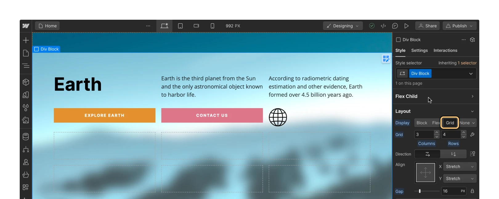
You can edit the grid right there in the Style panel or in grid edit mode. To open grid edit mode, click the “wrench” icon to the right of the Columns and Rows fields, or select the grid on the canvas and click the “grid edit” icon. To exit grid edit mode, click Done on the canvas overlay or click the “close” icon in Grid settings.

Add columns and rows
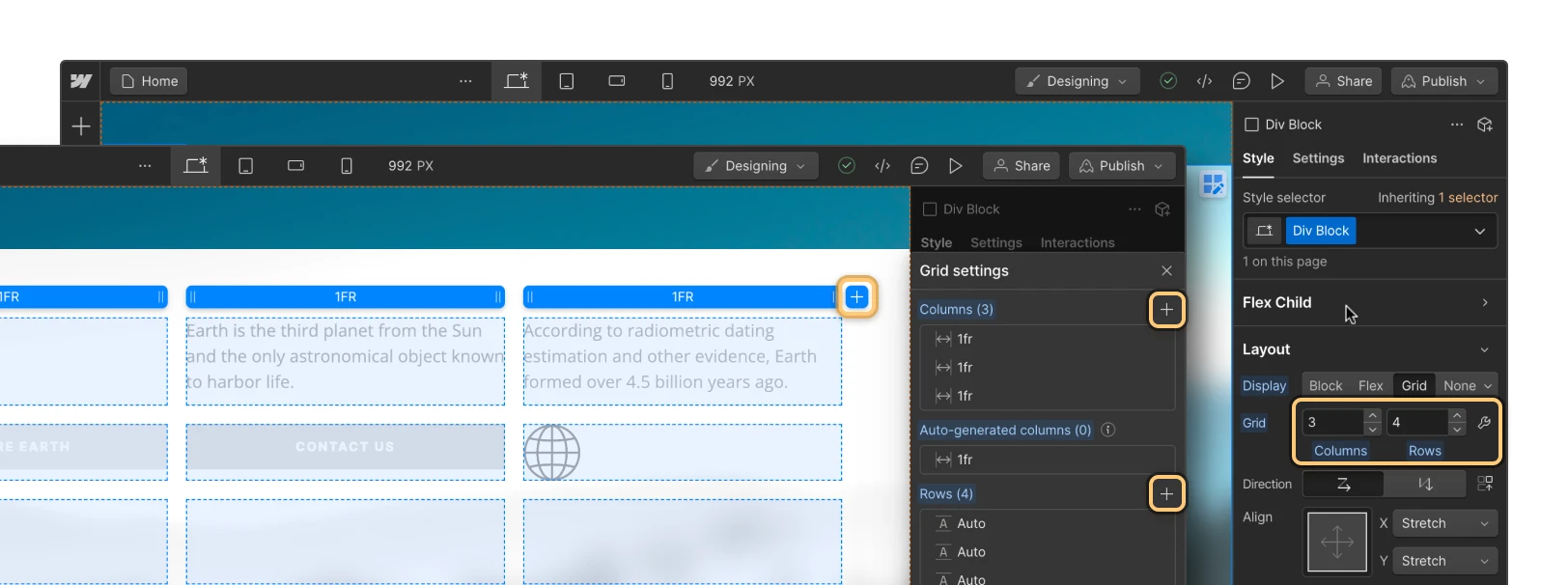
To add new columns and rows to a grid, go to Style panel > Layout > Display and use the “increase” button on the respective columns and rows fields. You can also:
- Type a number into the columns and rows fields
- Open grid edit mode and click the “plus” icon in Style panel > Grid settings
- Open grid edit mode and click the “plus” icon on the canvas
Duplicate and delete columns and rows
There are three ways to delete columns and rows:
- Use the “decrease” button on the columns and rows fields
- Open grid edit mode, hover over a column or row in Style panel > Grid settings, and click the “trash” icon
- Open grid edit mode, click or right-click on the column or row header on the canvas, and click Delete
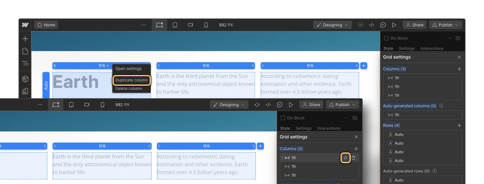
There are two ways to duplicate columns and rows in grid edit mode. You can hover over a column or row in Style panel > Grid settings and click the “duplicate” icon, or right-click on the column or row header on the canvas and click Duplicate.
Reorder columns and rows
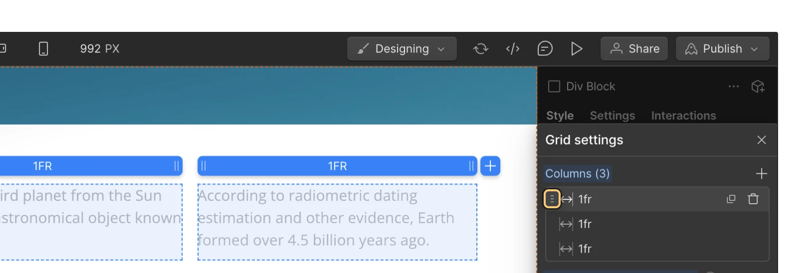
You can reorder columns and rows in grid edit mode. Hover over the row or column you’d like to move, then drag the handle that appears on the left side to its desired position.
Adjust gaps between columns and rows
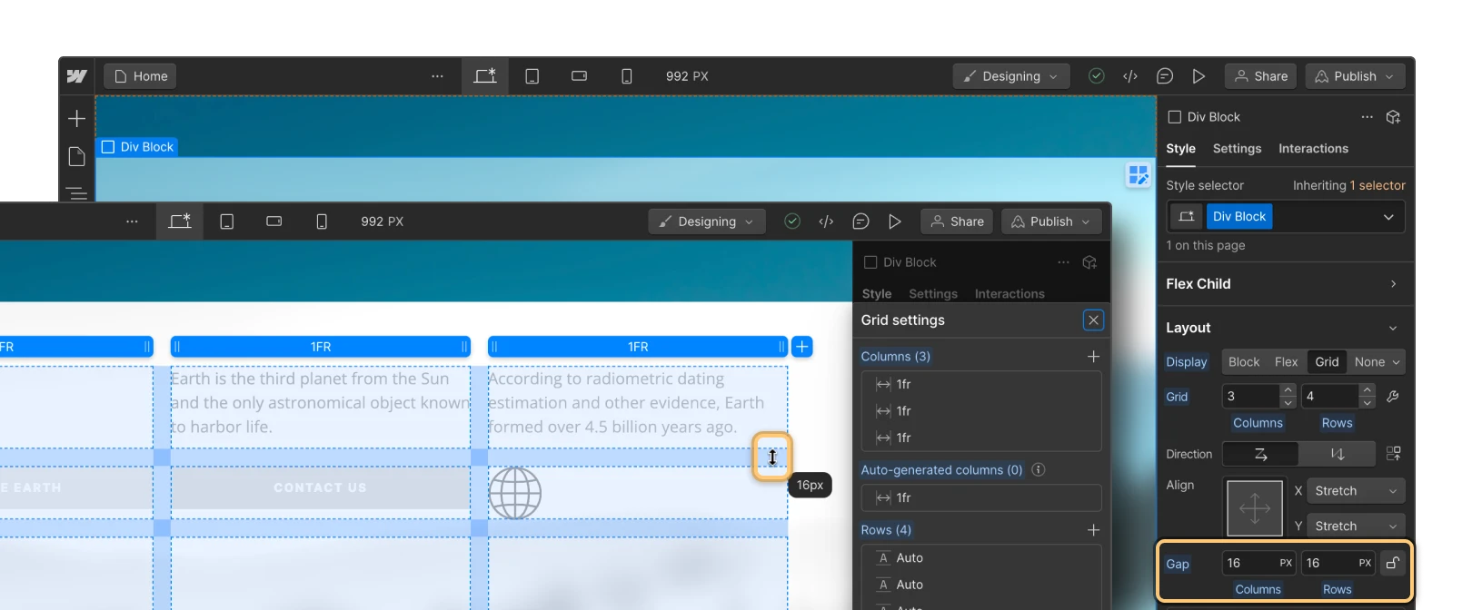
Gaps let you specify the space between columns and rows without having to add margin or padding. To adjust the gap size between columns and rows, go to Style panel > Layout > Gap and enter a value.
By default, gaps between columns and rows are locked. This means that if you change the gap size for columns, the gap size for rows automatically adjusts to the same number. To independently adjust the gap between columns and rows, click the “lock” icon to unlock them.
Pro tip
To quickly increase or decrease gap sizes, drag the Gap slider or hold down Option (on Mac) or Alt (on Windows) and drag your mouse left or right over the columns or rows field.
Adjust columns and row sizing
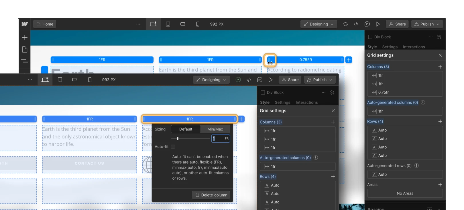
You can adjust the size of grid columns and rows in grid edit mode by selecting and dragging the column or row header to the desired size on the canvas. You can also enter a custom size for columns or rows by clicking a row or column header.
Grid sizing
You can use regular units (e.g., px, em, rem) when determining grid sizing, or you can use FR units. The FR unit represents a fraction of the available space in the grid. You use it to define the length of rows and columns just like a percentage or pixel unit, but, unlike fixed percentages or pixel units, the FR unit automatically calculates row and column space while adjusting for gaps.
You can also set min/max values to ensure your rows and columns don’t shrink beyond a set minimum value or expand beyond a set maximum value. For example, if you want your rows to have a minimum height of 200px, you can set the min value to 200px and the max value to auto. Then, the row will grow based on the content inside and never shrink beyond 200px.
How to place content in a grid
You can add any child elements (e.g., headings, images, div blocks, etc.) inside a grid. By default, every new grid child will populate an individual grid cell and fill in the next available cell from left to right. If there are no more available cells in a row, a new row will be generated to house the new grid children.
Change the direction grid content flows
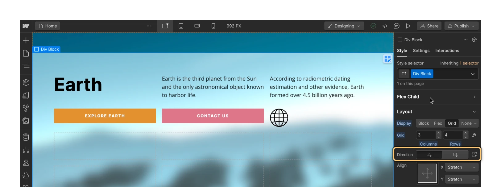
You can change the direction of grid children in Style panel > Direction. Here, you can select horizontal, which places children from left to right, or vertical, which places children from top to bottom.
Manually position content in a grid
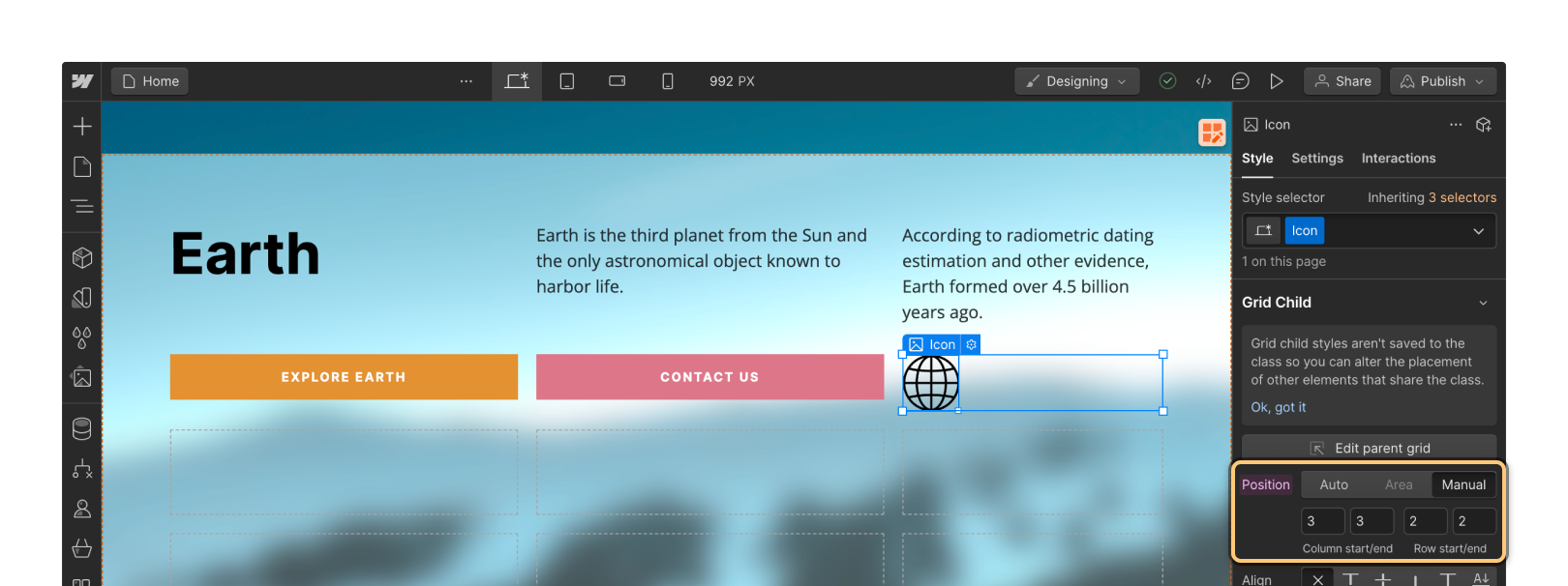
To manually position content in a grid, hold Shift while you drag the element into the grid. You can also change the position setting of an existing grid child to manual. To do so, select the grid child, go to Style panel > Grid child > Position, and set it to Manual.
Manually-placed grid children remain in their designated grid cell whereas automatically-placed grid children move into the next cell to accommodate new grid children.
How to nest multiple elements in a grid cell
You can add multiple elements to a single grid cell by nesting elements within the grid child. To do this, you’ll first want to add a structure element (e.g., a div block) to the grid as the direct grid child. Once you’ve added the structure element as the grid child, you can add other elements to the div block by holding Command (on Mac) or Control (on Windows) while you drag the elements into the grid cell. You can also select the structure element and use quick find to add additional elements.
Duplicate content in a grid
There are two ways you can duplicate a grid child to reuse the same content in more than one grid cell:
- Hold Option (on Mac) or Alt (on Windows) and drag the content to duplicate it and move it into a new grid cell
- Select and copy the content, then select the grid and paste the content
How to move, span, and align content in a grid
Once you’ve placed your content in a grid, you can customize the content’s design. You can move the content around to reposition it in different cells, span the content to take up multiple cells, and even adjust alignment of the content within the grid.
Move grid children
To reposition content in the grid, select and drag the grid child to the desired location on the canvas or in the Navigator.
Set grid child order
You can also set the order of grid children by selecting the grid child and going to Style panel > Grid child > Order.
Align content in a grid
To update the alignment for all grid children, select the grid and go to Style panel > Layout > Align. There, you can use the align box (i.e., the 3 x 3 grid) to quickly align grid content. The X and Y axis controls reflect the value you set inside the align box. Learn more about using the align box.
To change the alignment of a single grid child, select the grid child and go to Style panel > Grid child. There, you can set alignment or justification for the grid child in Align and Justify.
Span grid children
To span an automatically positioned grid child across multiple grid cells, select the grid child, go to Style panel > Grid child > Position, and specify how many columns and rows the grid child should span.
To span a manually positioned grid child, select the grid child, go to Style panel > Grid child > Position, and enter which column and row the grid child starts and ends in.
Lock grid child positioning
Negative numbers let you position grid children relative to the end of the grid — they reference cells from right to left or bottom to top.
Negative grid child positioning values are great if you:
- Don’t want to re-span your navbar to fill all columns each time you add new columns — position the navbar between column 1 (the first column) and column -1 (the last one)
- Want to keep your footer in the last row of the grid no matter how many rows you add to your grid — position your footer in row -1/-1
- Want to keep the main content section always centered in your grid with the same number of columns on each side — set the “end” value to be the negative equivalent of the “start” value (e.g., 3/-3). If you remove columns on smaller breakpoints, the child will remain centered.
Clear grid child settings
Grid child settings apply only to the selected element and aren’t saved with the class. Pink labels in the Style panel show changed settings applied to the selected element on the current breakpoint. These settings cascade to lower breakpoints and are indicated with orange labels. The indicator will turn pink again when you override an inherited (i.e., orange) setting on a smaller breakpoint.
To remove any applied grid child setting, click the pink label on the setting, then click Reset.
Overlap grid children
Grid children with manual positioning will automatically overlap when they intersect in the same cell(s). You can control the stack order of those overlapping elements by repositioning them in the Navigator or by adjusting positioning and z-index settings.
Fill empty grid cells
Empty cells might remain in the grid when you have spanned grid children. To automatically populate these cells with content, go to Style panel > Layout > Direction and click the “dense” icon.
Important
The dense setting attempts to fit grid children into empty cells of your grid. This can be bad for accessibility, as it only alters where items display, not where they appear in the page’s source.
How to design a responsive grid
To design your grid so it’s responsive across screens, you can either manually delete columns on smaller breakpoints or enable auto-fit to automatically generate columns and rows to accommodate smaller screen sizes.
Manually style the grid layout across breakpoints
To make sure your grid is responsive on all devices, remove columns on smaller breakpoints as needed.
If you can’t remove columns on smaller breakpoints:
- Try setting your grid Direction to Row
- Make sure you haven’t manually-positioned grid children in those columns
- Make sure you don’t have child elements spanning those columns
Enable auto-fit
Auto-fit is one of the most powerful features of grid. It allows you to automatically repeat and wrap columns so the grid works across every screen size — no per-breakpoint adjustments needed.
To enable auto-fit, delete all but 1 column and 1 row in your grid. Then, go to grid edit mode, click the column’s header, set minimum and maximum dimensions for the column, and check Auto-fit. More columns will automatically generate and repeat to responsively distribute content in your grid.