Use flexbox for precise alignment and stacking control when designing layouts.
Flexbox, also known as flex or flexible box layout, lets you align elements in a box. Flexbox offers layout control in 1 dimension — either vertically or horizontally. It is a display setting, which means you can set flexbox on other elements.
Flex parents and children
When you set flexbox on an element, you typically set it on a parent element, so you have control over the alignment of children elements. A parent element using flexbox is also known as the “flex parent.” A direct child element of a flex parent is also known as a “flex child.”
You can create a flex parent out of any element that contains other elements. To create a flex parent:
- Select the element (e.g., section, div block) on the canvas
- Go to Style panel > Layout > Display
- Click Flex
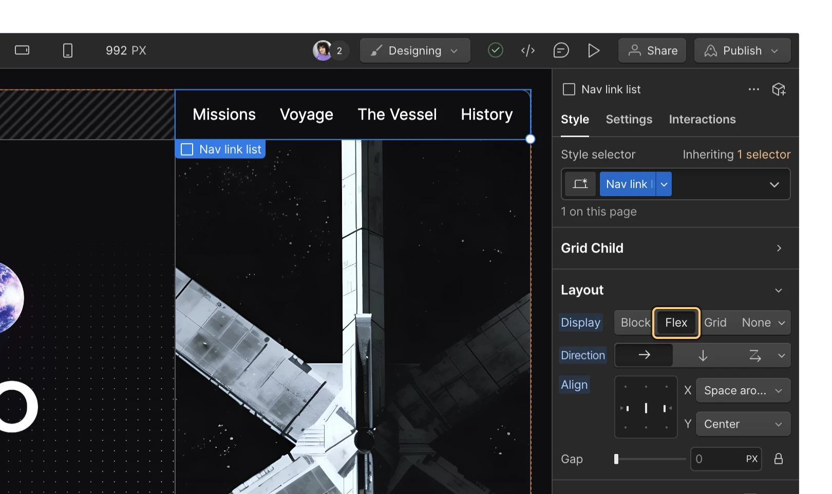
Unlike other display settings, enabling flex on a parent element affects the layout of the direct child elements. By default, children align left and stack horizontally when you enable flexbox on a parent element. You can adjust this display in flex parent settings.
Note
Elements set to flexbox won’t affect the layout of the children within their direct child elements.
Flex parent settings
Once you set flexbox on a parent element, you’ll have various layout options for the flex parent and its child elements:
Set or reverse the direction
Flex parents lay out their content in a left-to-right horizontal direction by default. To set the direction, select the flex parent and go to Style panel > Layout > Direction and choose either horizontal or vertical (each represented with “arrow” icons).
You can also reverse the direction of the flex children inside the flex parent. Select the flex parent, go to Style panel > Layout > Direction, and click the dropdown arrow to open the Wrap dropdown. There, you can choose Right to left > Single row or Bottom to top > Single column. This flips the order of your flex children, so the first element is now last, the second element is now second to last, etc. Reversing the flex parent’s direction is useful for right-to-left sites or when designing on smaller breakpoints.
Note
If you reverse the direction of your flex parent, the position of flex children in the document order doesn’t change. This means that the visual order and DOM order of elements won’t match, which can be confusing for site visitors.
Wrap or reverse wrap flex children
In the Wrap dropdown, you’ll find options that combine direction and wrap controls. By default, flex children will try to fit on a single line, overflowing the flex parent if necessary. You can change that by wrapping the children. Select the flex parent, go to Style panel > Layout > Direction, and click the dropdown arrow to open the Wrap dropdown.
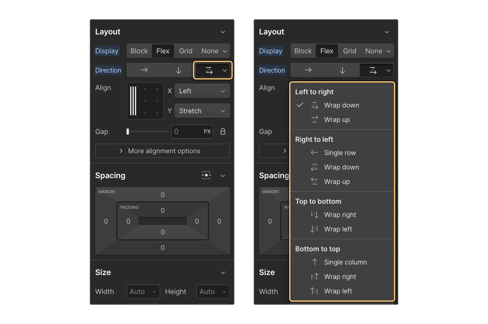
There, you can choose from a number of Wrap options depending on how you want to arrange your content:
Left to right
You can arrange your content horizontally from left to right with the following options:
-
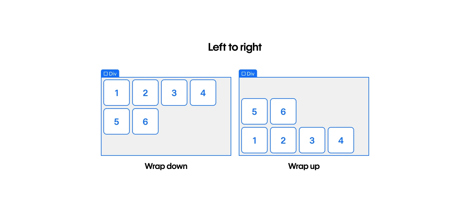
Wrap down — wraps flex children that would overflow the parent to a new line below
-
Wrap up — wraps flex children that would overflow the parent to a new line above
Right to left
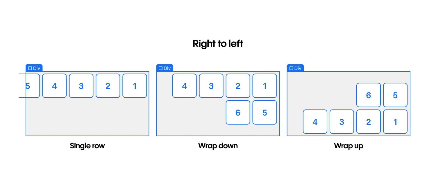
You can arrange your content horizontally from right to left with the following options:
-
Single row (no wrapping) — reverses the order of the flex children and does not wrap any children that would overflow the parent to a new line
-
Wrap down — reverses the order of the flex children and wraps any children that would overflow the parent to a new line below
-
Wrap up — reverses the order of the flex children and wraps any children that would overflow the parent to a new line above
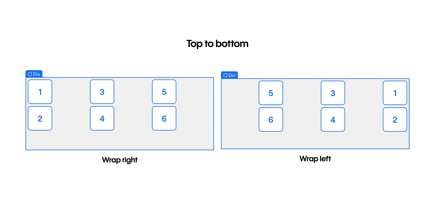
Top to bottom
You can arrange your content vertically from top to bottom with the following options:
-
Wrap right — wraps flex children that would overflow the parent to a new column to the right
-
Wrap left — wraps flex children that would overflow the parent to a new column to the left
Bottom to top
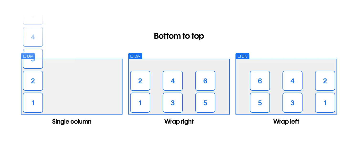
You can arrange your content vertically from bottom to top with the following options:
-
Single column (no wrapping) — reverses the order of the flex children and does not wrap any children that would overflow the parent to a new column
-
Wrap right — reverses the order of the flex children and wraps any children that would overflow the parent to a new column to the right
-
Wrap left — reverses the order of the flex children and wraps any children that would overflow the parent to a new column to the left
Align flex children
You can align multiple rows or columns of flex children in Style panel > Layout > Align.
The align box (i.e., the 3 x 3 grid) lets you quickly align flex children inside the flex parent. The X and Y axis dropdowns reflect the value you set inside the align box. Learn more about the align box.
Note that some options aren’t available through the align box alone, but you can access these using the X and Y axis dropdowns. The alignment options available in each dropdown differ depending on whether the flex direction is horizontal or vertical (i.e., whether you’re aligning rows or columns of flex children).
Horizontal direction
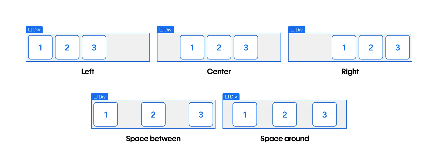
When flex direction is set to horizontal, the X axis dropdown provides the following alignment options:
-
Left — flex children are aligned to the left of the flex parent
-
Center — flex children are centered inside the flex parent
-
Right — flex children are aligned to the right of the flex parent
-
Space between — flex children are evenly distributed from the right and left edges
-
Space around — flex children are evenly distributed between other rows and edges
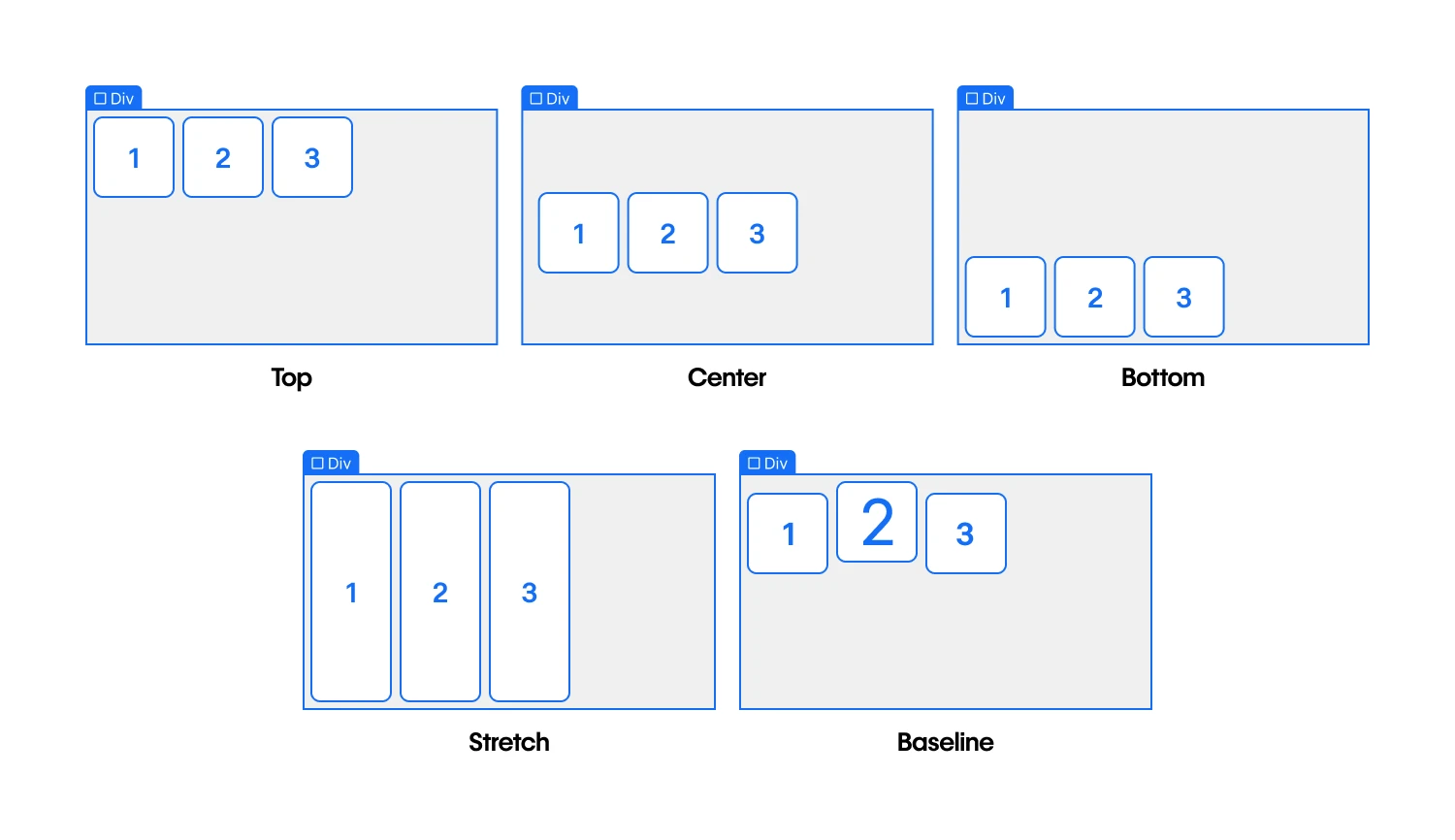
The Y axis dropdown provides these options for aligning horizontal rows of flex children:
-
Top — flex children are aligned to the top of the flex parent
-
Center — flex children are centered inside the flex parent
-
Bottom — flex children are aligned to the bottom of the flex parent
-
Stretch — flex children stretch to fill empty vertical space
-
Baseline — flex children are aligned to their baselines, or the invisible line that text sits on
Vertical direction
When the flex direction is set to vertical, the X axis dropdown provides the following alignment options:
-
Left — flex children are aligned to the left of the flex parent
-
Center — flex children are centered inside the flex parent
-
Right — flex children are aligned to the right of the flex parent
-
Stretch — flex children stretch to fill empty horizontal space
-
Baseline — flex children are aligned to their baselines, or the invisible line that text sits on
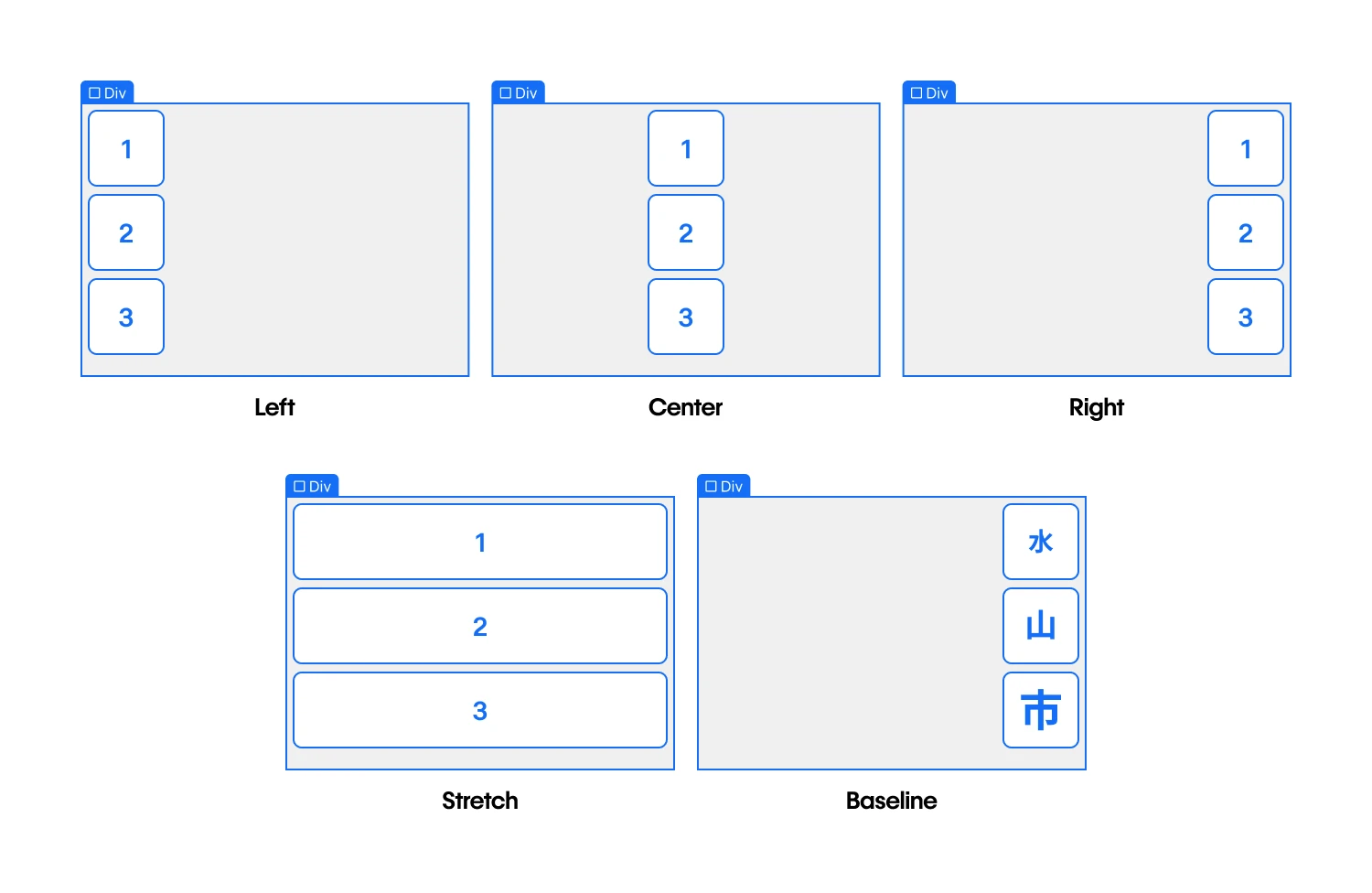
Pro tip
Vertical baseline alignment can improve the readability of vertical text elements, especially in languages or designs where vertical text orientation is common or preferred.
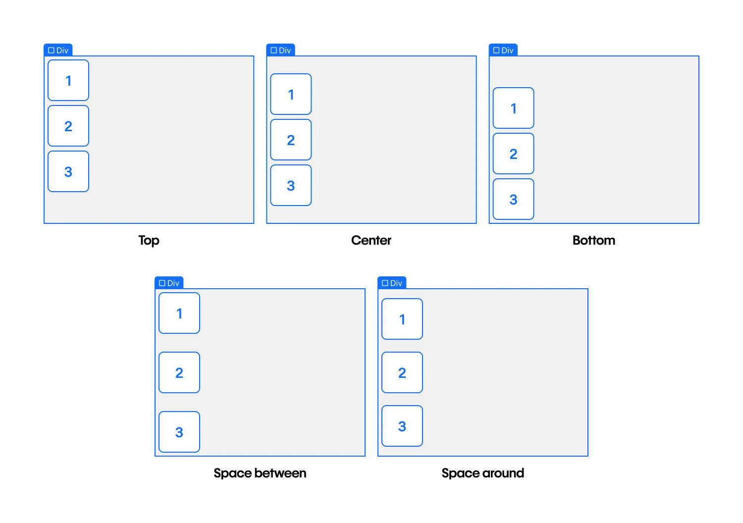
The Y axis dropdown provides these options for aligning vertical columns of flex children:
-
Top — flex children are aligned to the top of the flex parent
-
Center — flex children are centered inside the flex parent
-
Bottom — flex children are aligned to the bottom of the flex parent
-
Space between — flex children are evenly distributed from the top and bottom edges
-
Space around — flex children are evenly distributed between other rows and edges
Add gaps between flex children
Gaps let you specify the space between flex child elements without having to add margin or padding. To adjust the gap size between columns and rows, select the flex parent and go to Style panel > Layout > Gap.
By default, gaps between columns and rows are locked. This means that if you change the gap size for columns, the gap size for rows automatically adjusts to the same number. You can click the “lock” icon to independently adjust the gap between columns and rows.
Pro tip
To quickly increase or decrease gap sizes, drag the Gap slider or hold down Option (on Mac) or Alt (on Windows) and drag your mouse left or right over the columns or rows field.
Flex child settings
The default layout of flex children is based on the flex layout settings set on the flex parent. However, you can override these settings for a flex child:
Change the size of a flex child
You can adjust the sizing of a flex child by selecting the child, then going to Style panel > Flex child > Sizing. There are 4 options for sizing:
- Shrink flex child if needed (to prevent overflow)
- Grow flex child if possible
- Don’t shrink or grow flex child
- Custom grow and shrink behavior
If all flex children are set to either Grow if possible, Shrink if needed, or Don’t shrink or grow, any remaining space after they have been sized will be distributed evenly to the children set to Grow if possible.
Shrink if needed
Shrink if needed lets you size a flex child based on its width and height properties (or the content inside the flex child, if width and height are not set). This makes the flex child inflexible when there is free space left but allows it to shrink to its minimum when there is not enough space.
Grow if possible
Grow if possible lets flex children grow if there is space to do so. This lets the flex children absorb any extra space in the flex parent.
Don’t shrink or grow
Don’t shrink or grow lets you size the flex child according to its width/height properties, and makes it fully inflexible. The flex child is not allowed to grow or shrink, even in an overflow situation.
Customize grow and shrink behavior
You can also choose to fully customize the grow and shrink behavior of a child element. This determines how much the flex child shrinks or grows relative to other child elements in the flex parent.
The Grow value defines how much the flex child can grow relative to other child elements when free space inside the parent element is distributed. If the value is set to 0, it won’t grow larger than it needs to.
The Shrink value defines how much a flex child can shrink relative to other children when negative free space is distributed. If the value is set to 0, it won’t shrink, even in overflow situations.
The Basis value determines the default size of an element before flex-grow or flex-shrink come into play. You can set this to a specific dimension (e.g., 20%, 250px, etc.) or Auto. If set to Auto, the default size of a flex child will be based on its width or height — if set — or its content. If the basis value is set to a specific dimension, the content or width/height of an element will be ignored and the flex child will share the size with other flex children in the same flex parent.
Change the alignment of a flex child
You can adjust the alignment of a flex child by selecting the child, then going to Style panel > Flex child > Alignment and order. There are 6 options for alignment:
- Auto (the default value)
- Top
- Center
- Bottom
- Stretch
- Baseline
Note
You can also use auto margin to align flex children.
Change the order of a flex child
By default, flex children display in the order that they are placed in the source code (you can view this order in the Navigator). Reordering flex children comes in handy if you want to adjust your design on different breakpoints.
To override the default order of a flex child, select the child and go to Style panel > Flex child > Order. There are 6 options for ordering:
-
Don’t change — keep the flex child in its default place
-
First — the flex child appears first in the flex parent
-
Last — the flex child appears last in the flex parent
-
Customize order — control the display order of several flex children by defining custom order values
You can define custom order with a number, which specifies the order in which the flex child appears inside the flex parent. Flex children sharing the same custom order value are laid out in the order they were originally placed.
When using custom order, don’t use First or Last to specify the first or last child elements. First sets the flex child’s order to -1, and Last sets the flex child’s order to 1. When using custom order, any number greater than 1 will place the flex child after any flex child with order set to Last. Any number smaller than -1 will place the flex child before any element set to First.
Note
If you change the order of flex children, their position in the document order doesn’t change. This means that the visual order and DOM order of elements won’t match, which can be confusing for site visitors.